When guests book a vacation home, they’re not just paying for a roof over their heads, they’re investing in an experience. They want a home-away-from-home that feels warm, comfortable, and inviting the moment they walk through the door.
So why is it that so many vacation homes default to stark, white walls?
The truth is, while white may look “clean” in photos, it often comes across as cold, clinical, and impersonal in person. Instead of relaxing, guests can feel like they’ve stepped into a hospital corridor or an unfinished rental property. And in the vacation rental business, that’s a problem, because emotions drive bookings.
Why White Walls Don’t Work in Vacation Homes
Cold & Stark Ambiance
White can be too sharp under artificial lighting, making rooms feel sterile instead of soothing. Guests don’t want “blank canvas” vibes, they want warmth and character.Lack of Emotional Connection
A true home-to-home experience comes from cozy colors that trigger feelings of relaxation, safety, and comfort. White walls rarely spark that emotional bond.High Maintenance
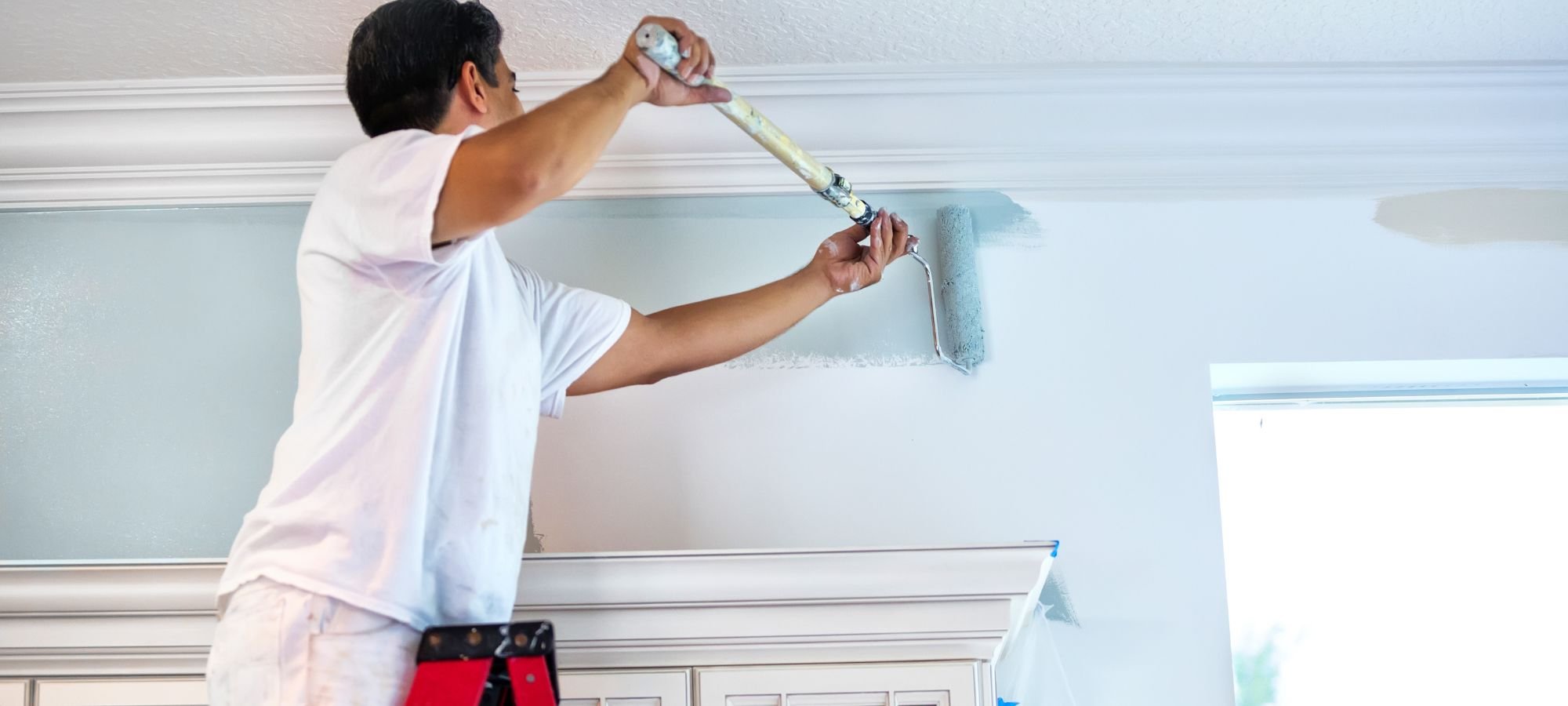
Vacation homes see a lot of traffic. White walls show every scuff, fingerprint, and suitcase mark. Neutral but warmer tones camouflage wear-and-tear far better.
What Guests Actually Want: Warm, Welcoming Colors
According to color psychology, certain shades are proven to make people feel more comfortable and at ease, exactly what you want in a vacation property.
Here are on-trend paint colors for Fall 2025 that create that inviting vibe:
Warm Taupe & Greige – Elegant, versatile, and much easier to live with than white. Creates a modern yet cozy feel.
Soft Terracotta – Earthy, warm, and trending big this Fall. Adds depth without overpowering a space.
Muted Sage Green – Calming and connected to nature. Perfect for vacation homes near lakes, trails, or parks.
Buttery Cream or Almond – Lighter than beige, but warmer than white. A guest favorite for bedrooms and living rooms.
Dusty Blue or Smoky Teal – Serene, coastal, and timeless. Works beautifully in Florida vacation rentals.
Design Tip: Use White as an Accent, Not the Star
If you love the crispness of white, use it strategically:
White trim and doors can pop against warmer wall shades.
White bedding looks fresh against cozy wall tones.
A mix of neutrals (taupe, greige, cream) can create a layered, sophisticated look that still feels inviting.
Why This Matters to Your Vacation Rental ROI
First impressions sell. In a competitive Orlando, Davenport, and Kissimmee rental market, a guest scrolling through dozens of listings will stop at the one that feels like home. Warm, inviting wall colors photograph beautifully, stand out from the endless “white box” homes, and make guests more likely to book, leave glowing reviews, and return year after year.
✨ Ready to make your vacation home stand out?
Small design changes, like updating wall colors, can have a big impact on your rental income and resale value.
📞 Contact Michelle Baydemir, Broker/Owner at Vacay & Co Real Estate for expert advice on getting your home rental-ready or prepped for sale.
📧 [email protected] | 📲 321-333-1338
🌐 www.vacayreflorida.com
Check out this article next